|
Curatorial Rationale
My big idea for my work of art is a murder mystery represented through expressional portraits. I choose this because faces are one thing, I’ve always wanted to make art for. Through this process, finding exactly what I wanted my breath of work to revolve around was hard. My original Idea was worldwide espionage. Using printmaking, comic style ideals from my favorite artist Roy Liechtenstein. The development of my skills as an artist was more of a mental gain. Before I honestly couldn’t finish much art without feeling the desire to quit because I didn’t think my work was good enough. Over this past year I’ve learned to have motivation, and to continue without giving up if I want to create something, I can be proud of. My big idea took many shapes in order to become a murder mystery through emotional portraiture. Coming into the art show I thought I could do something revolving around anime, seeing as I appreciated the style and liked it a lot. But there were better ways I could have portrayed this anime style that I admired, stepping out of my comfort zone was tough because I didn’t really know pop artists or the style until I found Roy Lichtenstein. Roy Lichtenstein was a big inspiration for my art works. I liked how he used thick bold black lines and now a lot of color to create big art works of characters. There is storytelling in his artwork. I wanted to use that storytelling through my own artwork. From my artworks “Witness” and “Framed” you can see the development of a story. Telling a story is how I wanted my art conveyed, putting the pieces together is what makes it unique. I did this because moving to a comic book feeling I thought It would be cool if there was a story. You could even compare it to comic panels, minus the words. In creating my piece of art, I had to figure out what exact story I wanted to tell. My first main Idea being espionage I wasn’t sure what exactly I wanted to say. Each piece could have told its own tale but that’s not what I was looking for. After creating My first piece Framed, I learned that I could link all of my pieces together. While they are all different, they would still connect to each other. Weather that was through repeating characters or just constant themes that make sense within a murder mystery. My art ability was tested as well. I don’t draw much realism, but when sketching each piece, it seemed like that’s exactly what I had to do. Drawing faces was one thing as an artist I wasn’t very good at. This project was something that would really help me improve my drawing ability. It wasn’t easy though, through this process I noticed it was a lot more difficult in the beginning. Understanding proportions and using that skill is hard to do, there are many organic shapes and curves that have to be correct or else the face looks off. Using the grid strategy saved my work. It was time efficient, easy, and my proportions became better. So now I can look at a cohesive amount of work that looks nice. Proportional faces, proper shadows, appropriate line weights. Using big solid blocks of colors with heavy weighted black lines to support it was the way I liked to do my pieces in. In Gone you can see how much black I used in order to accent the character but also to portray the theme that this person is the one we lost. Rather in Framed I didn’t use as much black, besides it being in a color pencil I liked the way it seemed like there was light, a spotlight, point at the man, when there is light there is not much shadow. That’s what I was going for. The distribution in line weight really helped my artworks look interesting, and unique. The thing I want you to take away from my art is a sense of fun in art, not all art has to be confusing and hard to understand. Just look at art for what it is. You don’t have to interpret anything extremely hard, it’s just a game of who did it and putting everything together to make an interesting story. |
|
|
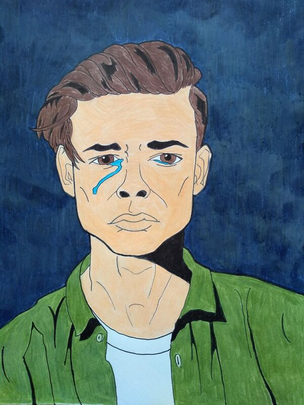
Title: Framed
Medium: Color pencil, Ink Size: 27.94x21.34cm Intention: The emotion on the man's face is sadness and fear. After being framed for the killing of Bella Sanctum. The navy blue background is to represent defeat and mystery along with sadness. The tears falling from his face are there to further show how upset he is. But if he didn't do it, who did? |
|
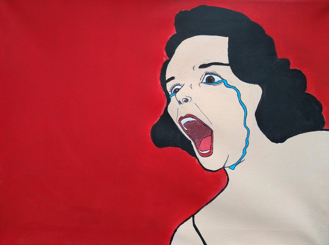
Title: Appallment
Medium: Acrylic, Ink Size: 40.64x30.48cm Intention: The emotion on the women’s face is shock and fear and heartbreak after discovering that Bella Sanctum is dead. The red background represents danger and frustration. Along with blood and murder. The blue tears are there to help show sadness along with balance out the warm overbearing tone of red. Did she see anyone around? |
|
|
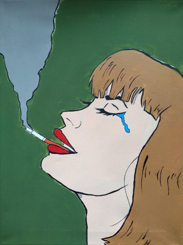
Title: Grief or Relief
Medium: Acrylic, Ink Size: 40.64x30.48cm Intention: This piece is of a woman smoking and crying. She’s crying because person accused of the murder if her significant other. Unable to do anything he tries to relieve her stress with a cigarette. She smokes with a crooked smile out of eeriness. The green background helps show the relief state that she’s experiencing. Will she ever get her husband back? |
|
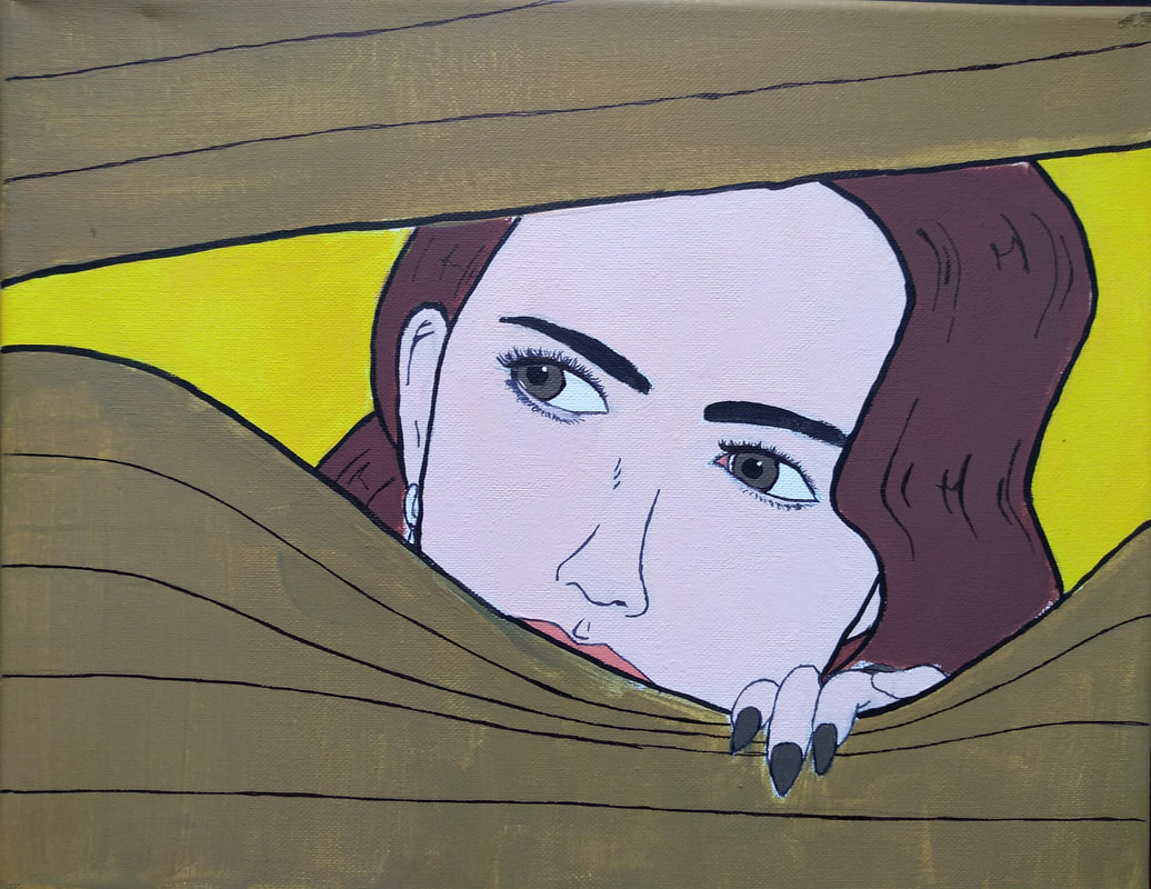
Title: Lookout
Medium: Acrylic, Ink Size: 36.83x27.94cm Intention: This piece is of a woman looking out of a window through blinds. Waiting for the authorities to arrive. The yellow is supposed to represent the innocence of the woman. The golden blinds help show that the surrounding people have gathered for some form of fancy function. Will they arrive in time? |
|
|
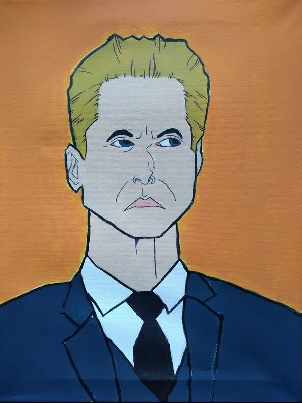
Title: Corruption
Medium: Acrylic, Ink Size: 40.64x30.48cm Intention: This piece shows a man with a prominent figure, that is well dressed. Although looking very professional, the man himself is very shady. In this piece the eyes are looking to the side, that’s to insinuate a sense of suspicion and worry. The navy blue suit is there to show stature but also with the color helps show authority. But what is he fearful for? |
|
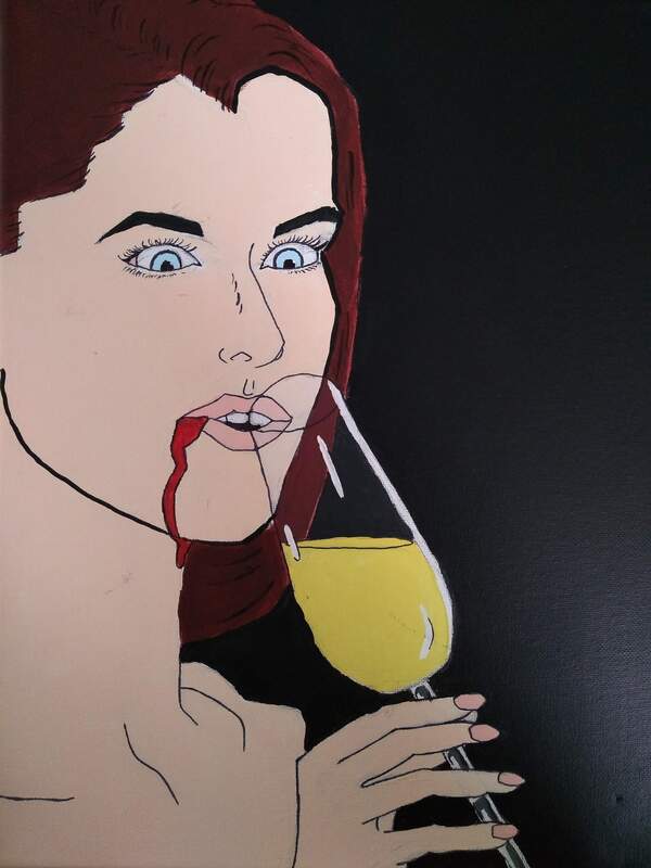
Title: Poisoned
Medium: Acrylic, Ink Size: 36.83x27.94cm Intention: This piece is of a woman being unknowingly poisoned. The black background is there to show death, giving of an eerie feeling. The blood dripping from her mouth to insinuate that something in the drink left her sick. The shock looks on her face as she’s bleeding unaware of what is happening to herself. |
|
|
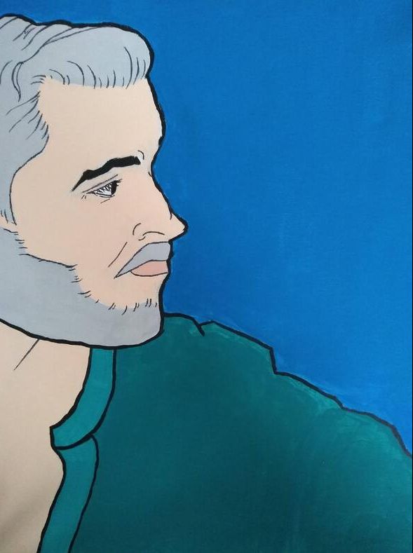
Title: Analysis
Medium: Acrylic, Ink Size: 40.64x30.48cm Intention: In this piece you see a man looking out into the distance. Reflecting on current events and how they could have occurred. His hair is grey to show that he is more of an older man, but also to show wisdom. The blue is to help show importance. The teal reflects thought and communication. But what does he know? |