|
Curatorial Rationale
Knowing what you want to do with your life is a complicated and difficult process for most to go through, it’s one I and countless other students are going through right now. Over the past six years, change has been a constant and evolving concept for me, and during that whole time, the boundaries of my interests, in addition to my plans, have changed alongside it. Art, however, has remained a consistent figure over the past few years and has served as an outlet but more importantly, as a way for me to understand myself and what I want to do with my life. Ever since I was young, I’ve been taking in the influence of my surroundings and the factors that have surrounded my life, in turn, building and designing have always been my go-to for self-expression, and those aspirations have led me to pursue architecture as a career. Art has helped me build a relationship between how I express myself and how I can develop a strong career, and this serves as a primary theme throughout my collection. Within my breadths of work, I hope to display my evolution of personal expression as well as my connection with my surroundings, just as they would be in my future as an architect. Growing up, the easiest way of expressing myself was through building with Legos and working with my hands, as time went on and my interest broadened, art became a primary resource for exploring my interests, as seen in my first still life. Representing my first major step forward with larger-scale, detail-oriented drawing, my piece Still Life helps demonstrate the basic artistic skills needed for a future in architecture. Those being curvature, line work, and texture. Being my first attempt, my goal was to contrast my interests in design with the everyday nature of items like cleaning supplies, while also symbolizing my everyday understanding of visual art and design-based drawing. Frequently, I also like to work in graphite, this being the first of many in this collection, as it is a medium that comfortably allows me to illustrate without minimizing technique. Another common theme within my work is the loneliness and independent aspects of the drawings themselves, for example, with the pieces The Good Earth and Incomplete, this idea is explored through the centering of the drawing and the emphasis put onto the drawing itself. This emphasis is a key feature of my work and helps bridge the divide between the subject matter of the piece and the way it is portrayed. Over my life, I’ve had the opportunity to see numerous examples of divine architecture and design, but none have been more impactful than those I grew up with. So, when deciding how to curate my space to best fit my big idea, I often had to consider growth. More than anything I wanted my exhibition to show my evolution as a visual artist, so how I displayed my work was an interesting challenge for me. With the focus of color being put on blue tones, commonly associated with emotion, I intentionally designed my page to convey a level of depth. This is also reflected in the demonstration of the artwork, pieces like Material in Motion as well as Health and Wellness are the first help to put emphasis on this idea. Displaying variety in my chosen style, the two also act as a stepping-off point for the viewer, these are the first examples of where my interests both in art and architecture come into play, and this is hopefully what the viewer takes away as well. Further cementing this idea is the chosen use of color throughout both the curated space as well my art, allowing for a larger contrast between my growth and my interests. Within the space, the color blue serves to create a feeling of progression and motion, so as the viewer is consciously analyzing my work, a feeling of development and evolution is subconsciously conveyed. |
|
|
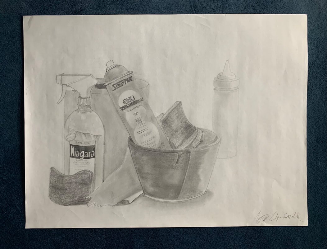
Title: Still life #1
Medium: Graphite pencil Size: 60.8x45.6cm Date: November 2019 Intention: Acting as a contradiction to its theme, this piece was my first focused attempt at the texture and curved line work. Serving specifically to highlight those aspects, the depiction on the paper is of irregular and varying products, and in the use of such products, the idea of contrast is further reinforced. This drawing acts as the ground level for my understanding of artistic expression and its connection within architecture and provides the viewer with a visual representation of growth through artwork. |
|
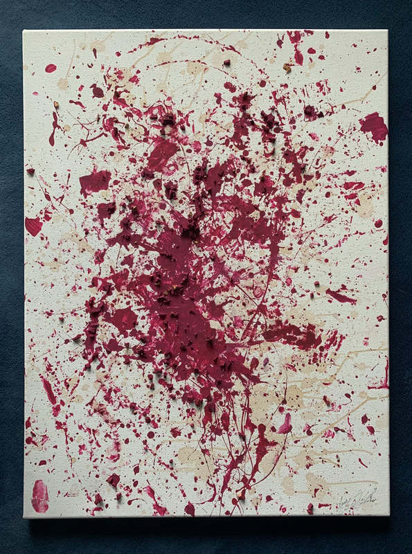
Title: Material in motion
Medium: Red Wine, red acrylic paint, wine cork/ cork bits Size: 45,7x60.9cm Date: November 2019 Intention: Taking inspiration from abstract artists like Jackson Polluck, this piece was an attempt at exploring the abstract concepts of art, in connection with material and product. Using both wine, paint, and cork as the mediums, the piece portrays emotion through striking color but more specifically, displays the less emphasized aspects of architecture. Those aspects often found in the design |
|
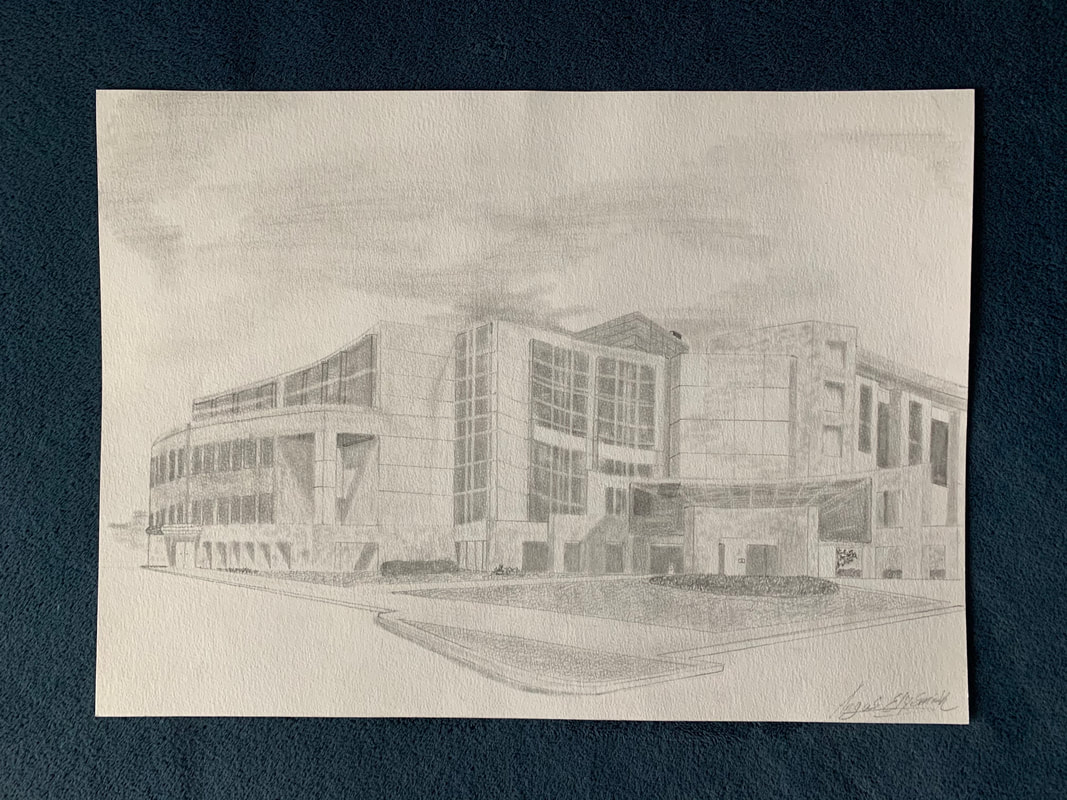
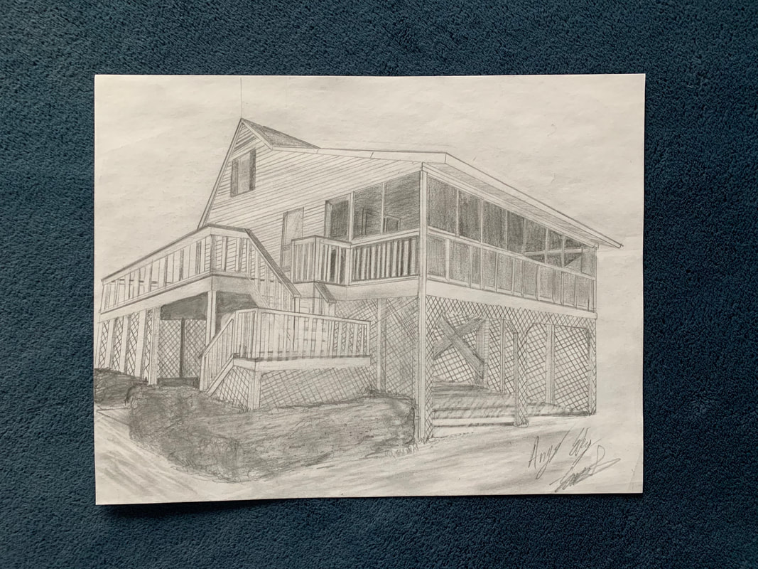
Title: Health and wellness
Medium: Graphite pencil Size: 42.8x29.2cm Date: January 2020 Intention: Growing up with a delivery nurse as a mother, I found myself at the hospital on a frequent basis. My mother would explain to me the importance of how hospitals were designed and how every detail had a specific purpose. This drawing of what was at the time called Clarion North Hospital conveys my appreciation of the building itself and what I learned as a result. As a child, I remember how grand and unique it was to me. This is also the first building I noticed for its architecture and beauty. |
|
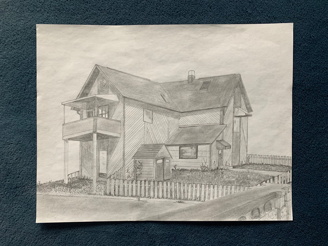
Title: The Good Earth
Medium: Graphite pencil Size: 27.9x21.4cm Date: September 2020 Intention: Growing up as a family friend of the shop owners, I would spend time as a kid engulfed in both the intricacies of the building and the lives of those working there. The former home has always provided an unbridle comfort for both its customers and employees, so more than anything, this piece acts as a recognition of the local and emotional significance. It also displays the adjusted nature of architectural structures by connecting the styles of home design with the functionality of a grocery store. |
|
Title: Johnson B
Medium: Graphite pencil Size: 27.9x21.4cm Date: October 2020 Intention: More than most things, the value I have towards spending time with my family is insurmountable. Growing up we would vacation on a small island off the coast of South Carolina, and more than anything, I was fascinated by the homes and designs that differed distinctly from those I was accustomed to. This piece highlights the differentiation between location and architectural significance while bridging the gap between my values and interests. |
|
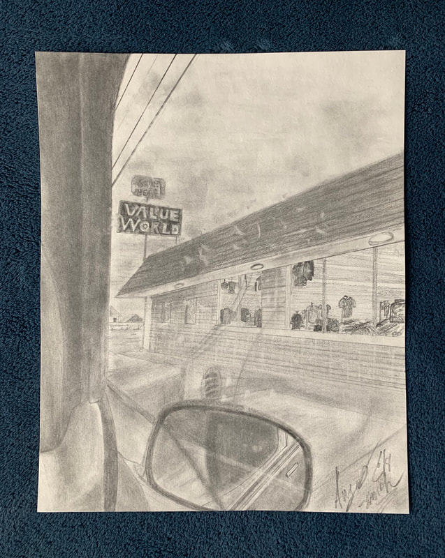
Title: After school
Medium: Graphite pencil Size: 27.9x21.4cm Date: October 2020 Intention: As I’ve gotten older, consistency has become less and less of a fixture in my life. Serving to embody the idea of personal nostalgia, After school portrays the facade of a thrift store but more specifically defines the minor moments in my life that I’ve appreciated and valued from the most. Displaying the passenger side perspective from the inside of a Ford Explorer, this piece metaphorically displays the frequent after-school trips to places around the city shared between me and my father. |
|
Title: Incomplete
Medium: Sharpie Size: 57.9x76.4cm Date: December 2020 Intention: While under the national quarantine and global pandemic, the concepts of isolation and lacking motivation became the forefront of many people’s social lives. This piece is meant to capture the incomplete nature of both how I’ve felt given the past year while taking inspiration from abstract artists like Piet Mondrian and his linework. Capturing both how I’ve felt and the symbolism of emotional distance, the piece compiles the ideas of isolation as well as how that feeling is displayed. |
|
Title: Home
Medium: Graphite pencil Size: 40.5x50.6cm Date: February 2021 Intention: Done in an abstract style, this piece depicts a raw interpretation of one’s home, breaking things done to their basic nature. Following in the footsteps of “Incomplete”, another breadth of work in this collection, this piece acts as a bridge between one’s uncertain feelings with discovery and clarity. “Home” serves to provide a sense of resolution for the viewer while also adhering to my architectural interests. |
